Monday, 7 April 2014

EXAM (ANNOTATION): Refinement

              
This piece is refined from my previous sketchbook and for this I have used a similar mark making techniques by using a sponge to create the small patches of paint. I used the sponge and then I went over the mark with a paint brush to add depth and texture. I used several shades of grey and this helped the tone vary throughout the piece. I think that this is a good refinement and I may use this technique in my final piece.

 This is another refinement, which takes inspiration from one of the artist responses I did for Alex Brewer's work. I used acrylic paint for this piece, as well as addition pencil, teastain and collage.  

This piece was created by imprinting black and white acrylic paint from another source onto this page and then covering the marks with teastain. I think this is a good effect and I may experiement with this more later on in my sketchbook. This piece also resembles another artist response from Brett Smith's work. Below is a close up photograph of the white acrylic marks. I like this effect as it is very subtle and you have to look closely to see them.    

 
This is further experiementation of the printing method (above). I also attempted using a roller and printing ink to create the background for this piece, however I think that it is too harsh for the idea that I have for my final piece. I like the imprints as it lifts the piece slightly and this is certainly something I want to use in my final piece. 
   
Here I have done the imprinting method again. I covered it in teastain and then added pencil marks which resemble those from Alex Brewer's work. I like this effect and I may use this in my final piece.


EXAM (ANNOTATION): Further Experimentaton

Sandpaper is something that I have been working with frequently and I have created some marks on the piece that I have been using so I thought that placing it in with some of my pieces of work would be another set of experiements. I attempted to use the shape of the mark to incorporate the sandpaper into my pieces as this would allow the mark to 'fit in'. This experiment allowed me to think about refining my work and the marks that I have made as this will allow me to take more time considering which type of marks I could make in my final piece. 


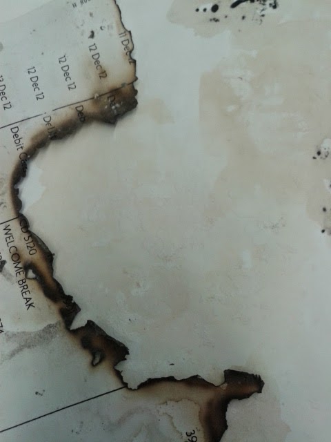
I experimented with burnt paper as this would show something being weathered and worn, and I had a similar idea from the last experiment to put the burnt paper with some of my existing pieces. In the photograph above, there are remains of burnt paper which I have placed in the left hand side of the piece. 


In this photograph, you can see the burnt piece of paper framing the white acrylic marks from one of my refinement pieces. I think that this worked well and this is something for me to consider to use in my final piece. I then later stuck some of these pieces down. 

EXAM (ANNOTATION): Artist Responses (Alex Brewer)

 
This piece was originally an oil pastel drawing which consisted of marks in the style and shape of an Alex Brewer piece. I didn't like this piece therefore I improved it by covering it with black and white acrylic by using the blotches method. I think that this was a huge difference and the piece looks a lot better. However in terms of an artist response, this piece doesn't entirely respond to the original as it doesn't resemble it on a large scale. I think this piece only took inspiration from the original.

These two pieces are a before and after. I first made the right hand mark, using oil pastel however I felt like this didn't resemble the piece at all, therefore I added black and white oil pastel to it. I used a paintbrush to apply the white acrylic, then I used a palette knife to apply the black acrylic. I did this in a freehand motion and then used the same knife to create the diagonal lines in the white acyrlic box. I liked using the palette knife as it allowed me to cover the area desired quicker than using a paintbrush and this is a tool that I am considering using in my final piece.


This was a similar situation to the previous piece as it is a 'cover-up' to improve the piece. I added black and white acrylic to the oil pastel mark and this improved it significantly. 

This is further use of the palette knife which is a tool I like using. I think if I combine this tool with a paintbrush and create marks with both, this may work well in my final piece.  

This was a similar situation to the previous piece as it is a 'cover-up' to improve the piece. I, again, added black and white acrylic to the oil pastel mark and this improved it significantly. 

EXAM (ANNOTATION): Mark Making based on Film Posters

These two marks are based on the film poster 'The Bride of Frankenstein'. I used colours which I could noticably see in the poster to create them. I also used a sponge instead of a brush to create them, as this added more texture to the marks.

These two marks are based on the film poster 'The Gold Rush'. I, again, used colours that I could see in the poster which generally consisted of black, white and gold. I used a paintbrush to create these marks as I wanted them to be neat and particular. I also took some inspiration from the marks that I had made from one of my artist repsonses for Brett Smith (Reeds 002) which you can see in the form of the white blotches overlaying the marks.

EXAM (ANNOTATION): Artist Responses (Brett Smith)


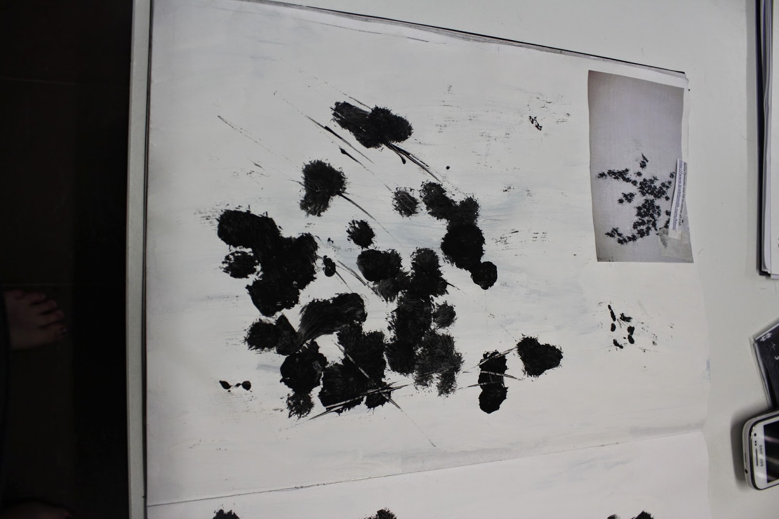
The piece that I was looking while completing this artist respnse was Spring Fireworks 002 by Brett Smith (http://www.brettlsmith.com/archive/index.php?album=spring-2007/). This artist response consisted of applying black acrylic paint to the page in 'blotches' as this is a similar method to the one that my artist uses. I think that this was successful as my response certainly resembles Brett Smith's piece. I also used an ink stick to create the small lines which trail off the blotches as this is something else featured in Smith's piece. Overall I think that this was a successful response however I think that I need to attempt to recreate the arrangement of the blotches as this would improve the piece.

Here I did two responses, both using the same method of application. This time I worked on the arangement of the blothes which was something I reflected on in my last attempt. I am unsure about the top piece as the arrangment still didn't look quite right in terms of being aesthetically pleasing however the bottom piece resembled Smith's very well depsite being slightly small. Next I think I might experiement with adding colour to my interpretation as I think it might lift it off the page slightly.

Here I added red and pink acrylic to the piece to lift it off the page however I don't think that this works as well as I hoped due to it being the wrong colours and them not fitting into the rest of the piece. I think that colours such as light browns may work well in this piece alongside teastain however I am not sure. Below this there is an experiment with added white acrylic paint blotches. These blotches are very subtle therefore I think that more paint needs to be used for them to give an effect. 

On the opposite page, there are imprints of the marks made and this gives off a more subtle effect. I then added more white acrylic and this improved the quality of the piece. This is something I am considering to use in my final piece as I like this effect.

This piece and the one of the opposite page is a response to Brett Smith's piece, August 003 (http://www.brettlsmith.com/archive/index.php?album=august-on-first-neck-lane-2007-2008/) and was created with acrylic paint in white, grey and black and pencil marks. The piece on the right hand side of the page was created using more white acrylic to change the tone of the piece. I used similar brush strokes in this piece going in different directions (as you can see from the photo above). I attempted to vary the shades of grey as this would add depth to the piece. I later added pencil marks which is something that features on the original piece. I also created a slight rip in the paint in the centre of the piece by using a piece of paper to protect it. Once I took the paper off, this was the effect created.

This piece was created in a similar way to the previous ones however I used collage in this piece to experiement with different methods. I then added teastain and more black/white acrylic paint at a later stage and this finished the piece. Overall I like this piece because it is exciting to look at as well as diversing itself from the previous responses to August 003.

This piece and the one on the previous page is a response to Cages 3 by Brett Smith (http://www.brettlsmith.com/archive/index.php?album=cages-2008/). This piece was created with black acrylic paint and this was created by using a paintbrush to create a variation of lines leading in different directions, therefore ending up resembling the artist's piece. I like this techniques a lot as I really like the look of the final piece however I don't think I am going to use this in my final piece as it is slightly too heavy to feature in my idea for my final piece.

This piece is a response to Reeds 002 (http://www.brettlsmith.com/archive/index.php?album=reeds-2005/). I used acrylic paint to create this piece and then added teastain and pencil at a later date. I didn't make this piece the same size as the original as it is 60 inches long, however I used the same techniques as Smith. I first painted a white acrylic background, then began to add the black vertical lines to the piece. I finished this piece by adding the grey and white blotches to overlay the lines. 

Saturday, 5 April 2014

EXAM (ANNOTATION): Film Posters experimentation


Gold Rush poster and my interpretation
This is the poster for the film Gold Rush (poster from http://flickfacts.com/movie/1441/the-gold-rush) which was made in 1925 by Charlie Chaplin. Gold Rush is a silent film and is never watched anymore as it was made almost 90 years ago. This makes this film weathered and worn as it is old, despite Charlie Chaplin's work being iconic and classic.
Next to it is my interpretation of the poster, which was created by using gold, black, white and brown acrylic paint. This is some experimentation to see if recreating film posters is something to consider doing for my final pieces. However I want to continue looking at mark making so I would need to find some way to merge these two ideas together.

Nosferatu poster and my interpretation
This is the film poster for the 1922 film Nosferatu by F.W Murnau (poster from http://derekwinnert.com/nosferatu-a-symphony-of-horrors-classic-film-review-237/). Nosferatu was one of the very first horror horror films about a vampire, which now goes unwatched as it is outdated and almost 100 years old.
Next to it is my interpretation of the poster, which was created by using black, white and yellow acrylic paint. This is further experiementation of recreating film posters however due to this result I may now consider experimenting with making these two interpretations weathered and worn.

Weathered and Worn poster (small)
 This is the result of the experimentation where I attempted to make my posters weathered and worn. I did this by ripping and adding creases to the poster and using sandpaper to rough the edges and I think that this gives a good effect to being weathered and worn. The rips (which can be see in the image below) further the meaning of the film not being watched anymore and this links to my concept even more.

Close up of the rips

Weathered and Worn poster (large)
Close up of sandpaper marks


Weathered and Worn poster (small)
 I used the same process as the previous poster to create the weathered and worn effect however for this poster I also used used coffeestain to make the poster and edges look even more worn and this furthered the effect.

Close up of the coffeestain effect

Weathered and worn poster (large)
I, again, used the same methods to create this weathered and worn effect on the large poster, however I used the ripping technique more and I also used slightly more coffeestain. I also used a small amount of charcoal to create smudges on the poster as this also furthered the effect.

Saturday, 15 March 2014

EXAM (ANNOTATION): Observational Drawings

Page One of Observational Drawings
Yarn Spindle
This page of observational drawings features 5 drawings which all came from the same object. This object (photographed below) was a spindle of yarn which was made of various colours and this made the object very exciting to draw. The item relates to my exam question of Weathered and Worn as this object is something that is often used by the elderly to knit with etc. so despite the object not being worn itself, it does have a very strong connection to something being old. Also many elderly ladies may use this yarn to knit clothes such as jumpers and scarves for family etc. and this means that the object created from the yearn will be 'worn' by the recipient. This object will also eventually become weathered and weak if used too much. 
To create three of these drawings (two at the top of page, one at the bottom of the page) I used a cross mark making technique, as this would create the crossing yarn look that the spindle has. For the top left hand corner drawing I used pencil and this was a nice effect as it also allowed me to get to grips with the item I was drawing before I attempted to use another medium. I drew the spindle as well as the rope which was laying around the yarn (part of the still life composition I was drawing). For the top right hand corner drawing, I used a combination of graphite and charcoal to create different tones within the drawing. I didn't want to overuse the medium therefore I did not create all of the crossovers in the yarn however I think that this gives the drawing a nice effect. For the drawing in the bottom half of the page, I used a variation of coloured chalk, in the colours; light blue, dark blue, orange, yellow and purple. For this drawing I did add more crossovers as the different tones created by the mixture of colours made sure that the drawing wasn't too overpowering to look at.
The other two drawings on this page are of the top of the spindle as there was a stick coming out of the top of it when we made the still life. I did two very quick one minute drawings of this. The first which is located in the lower left corner was drawn with charcoal which I smudged and used to create marks with. However I ran out of time during this drawing as I was attempting to draw as much in 1 minute and I spent too long on the smudging and detail. The other drawing which is located on the right hand side of the page was a 30 second drawing which, again, I spent too long attending to detail on. As a result of this, you are unable to tell what the drawing is meant to be of.


Page Two of Observational Drawings
This page of observational drawings features two drawings of very different things. 
The first drawing (on the bottom corner of the page) is a charcoal and white chalk drawing of the rope which was surrounding the yarn spindle in the still life composition. I used dark, harsh lines of charcoal to emphasise the sections of the rope and more charcoal which had been smudged to fill in and show the vertical strand texture inside. I also used smudged charcoal to create shading below the rope as there was a light source above the composition which created a shadow. I used a small amount of chalk to highlight a few areas where the rope was lighter, however they are not easily seen so I think I needed to use more of this to make it stand out more. This rope was fairly weathered and had a few stains on it therefore this links in to my exam question of Weathered and Worn.
The second drawing on this page is a motorbike glove drawn with graphite, white chalk and charcoal and set with hairspray, however I do not like this drawing much as I ran out of time to draw it and I did find it fairly difficult to draw. The motorbike glove does relate to my exam question as this is something that is worn a lot whilst riding motorbikes. I think that I may need to improve this drawing by adding rubber marks to it and this will add more depth to the drawing. 

Page Three of Observational Drawings
This page of observational drawings features a large drawing of an old glass bottle drawn with charcoal and set with hairspray.  This drawing's purpose was to cover up a previous drawing of three christmas baubles which was part of another still life that I was drawing. However I think that this now shows reflections in the glass and I like this effect. I do think that by adding rubber marks to this drawing would have created reflections of light in the glass and this would have made the drawing better. I created this drawing by having the stick of charcoal flat and then moving it in the direction of the glass to make it look slightly three-dimensional. If I added more rubber marks, or white chalk, this three-dimensional effect would be significantly better. I would like to work in this size more as I can be more expressive and free with the marks that I make and I prefer this style of drawing.
Page Four of Observational Drawings
On this page of drawings, the drawing at the top of the page has been replaced as I found it difficult to draw. These drawings are of film cameras which is the theme (old films) I want to look at whilst exploring this exam question. Many of these cameras are old and aren't used anymore therefore this also relates to the exam question of Weathered and Worn. 
The drawing on the left hand side of the page is of a camera lens which was drawn with charcoal and white chalk and hairspray to set. After the hairspray set the drawing I went over the white chalk with more to emphasise the reflections of light in the lens. I used different amounts of charcoal to create the different ridges of the lens and this was successful. 
The second drawing was of the corner of an old film camera. I used charcoal and chalk again to create this drawing and I used a similar technique to the drawing of the glass bottle (above), as I lay down the stick of chalk and used it to create texture of the camera. I used a combination of charcoal and white chalk to create the top half of the camera as this was lighter than the body. I also used the white chalk to create the raised lumps on the main body as there were reflections of light in the corners. 
The drawing I did to replace the top drawing was of a fairly old Canon camera.
 This drawing was drawn with pencil and this allowed me to create depth with different amounts of line.  I like this drawing as it is simple yet effective. I think that the detail of this drawing is also very good. I think that I should have used more rubber marks than just in the lens as this would show the reflections of the metal in the camera.