Monday, 24 February 2014

EXAM: Curtis Verdun Artist Analysis


Trepidation Oil on Canvas 22" x 28" 2004  (http://www.ebsqart.com/Artist/Curtis-Verdun/6988/Art-Portfolio/Trepidation/656405/)

Curtis Verdun is 'an abstract and portrait artist working out of his studio on Bayou Lafourche in South Louisiana. This areas rich culture and unique landscape has inspired the artist's work over the last 4 decades. One of the fondest memories during the artist's early life, Verdun recalls Christmas of '74. He was 12 years old then and one of the gifts his parents had given him was a Grumbacher oil painting set. Up to that point he had always been drawing and painting with whatever materials were available. Verdun is a self-taught artist, except for a one-week portrait workshop with Daniel Green in 1987. He feels that throughout his career he has learned much from reading about the great masters, both in technique and aesthetics. (Some of his favorite painters are the Abstract Expressionists.) To accelerate his learning, he has also copied their works, experimented with their various painting techniques and methods and prepared painting mediums by their recipes. He now even grinds some of his oil paints himself and also builds and prepares many of his own canvases.' (http://galerieverdun.com/art-cv/curtis-verdun-bio.htm) Verdun's artist statement says "Without the power of artistic expression, we would just do and say things as plain as computers or "androids". Nothing colorful would ever be expressed." (http://galerieverdun.com/art-cv/curtis-verdun-bio.htm) and this 
is something he is very passionate about in his work.

When studying this painting, I notice many things such as the different amounts of tone in the piece as well as the texture that using oil paint has created on the canvas. The abstract piece and the oil marks make an odd shape, which I think resembles a wound. Trepidation (which is the name of the piece of work) is a feeling of fear or anxiety about something that may happen. (https://www.google.co.uk/search?q=trepidation&rlz=....) 

This 2D piece which has 3D elements from the layers of oil paint, is 22 x 28 inches which is roughly 71.12 x 55.88 cm. There are variations in light featured in this painting, in the form of different shades of the colour grey which have been used in the painting. In the top left hand corner and the bottom right hand corner of the painting, a dark grey has been used, while within the rest of the background, a combination of light and medium grey has been used. There has been more of the dark grey colour used in the centre of the piece to create what looks like the beginning of the 'wound' which I described earlier. On top of this is a bright red which has been layered on top. I think that the red represents blood which a person may produce after being cut or hurt. The texture of this painting looks like it has been created by the layers of oil paint being put on to the canvas by using a painting knife or a similar tool. As stated before in the introduction, Verdun often preps his own canvas' to use in his work and this may have been one of the pieces where he has done so. I think that by preparing his own canvas has created the slight 3D textured effect in the top right hand corner of the painting. 

The immediate thing which catches the viewers eye is the bright red marks in the centre of the painting. This then leads the viewer's eye onto the dark grey, which eventually leads to the different gradients of the painting's background. I think this piece has been created for Verdun to experiment with abstract paintings as this was one of the first paintings that he produced. This painting is figment of his imagination which he longs to put into artwork and this may be another reason for the painting being produced.

This painting also encourages me to continue exploring layering and I have also began to think about using oil paint instead of acrylic, which is the paint that I have been working with, as I want to create the same texture and effects as Verdun does in his pieces. This may make my final pieces slightly more abstract however I need to experiment with this to see if I can achieve this effect.

EXAM: Alex Brewer Artist Analysis


"Untitled," 2011, mixed media on canvas, 60"x70"
localephemera.blogspot.com 

Native to Atlanta and known initially for name recognition as a graffiti artist with the name HENSE, award-winning public artist Alex Brewer’s nearly two decades of working in the realm of public art, grants, commissions, and cross-media connections have landed him local, national and international public art projects. Brewer developed his skill for graffiti in the mid to late ‘90s and early 2000s. Atlanta’s anti graffiti ordnance of 2003 moved Brewer into the realm of granted and commissioned public art. He has received numerous commissions, particularly from the city of Atlanta. The latest was the Arizona Avenue mural “Float,” in 2012. (http://hensethename.com/site/about) Brewer began his career painting and writing on walls in and around Atlanta and has since produced numerous public wall works internationally. Brewer currently lives and works in Atlanta GA. Normally the main medium that Brewer would use is graffiti paint, but in these two untitled pieces of work, he has used a combination of different mediums to create them and I think they are very unique.
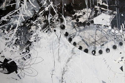
This mixed medium piece consists of white, tan colours and black. Featured in the painting are drips, like in the style of Cy Twombly, an artist I studied for my coursework unit. Twombly may be an influence for Brewer. The painting consists of a large black mark making painting at the top of the piece which is made up of shapes, lines and small drawings. Overlapping part of these black marks are more white marks in a similar style. Other than this, there are small detailed features in the painting which add more to the feel and uniqueness of it, such as the black dots in the top right hand corner, and the light grey marks in the white block that has been underneath the black marks.

There are many marks in this painting, some being linear. However the majority of these marks are very free hand painted and create the busy large black mark at the top of the painting. There are some strong contrasts between the very dark black and the light tan colour which is adjacent to it. This however creates diversity to the piece and allows the audience to focus more on what is going on with all of the marks in the black section. There isn't much diversity in terms of colours in this image, however there is a small section in the black section of marks, which is actually a small section of colour. This looks like spray paint, which reminds the audience that Brewer is still very involved in his graffiti work. This small mark consists of the colours orange (a secondary colour), red (a primary colour) and a greeny blue (tertiary colour). This is then blended into the piece using white spray paint to fade it slightly. Brewer has used many different shapes including many circles in this piece to lead the audience's eye throughout the piece. 
      

The viewer is encouraged to begin looking at the piece from the top left hand corner and make their way down to the very tip of the black mark in the right hand third of the painting. The black mark descends as it continues throughout the rule of thirds and this certainly encourages the audience to follow a path when viewing this piece. 

Brewer wanted to create this piece as a form of experimentation and created this piece as part of the group show he was invited to create work for, "Mark Making in Black and White." (http://localephemera.blogspot.co.uk/). Brett Smith (other artist I am studying) was also a part of this show.

This piece of work has encouraged me to persist with the idea of experimentation with layering and incorporating it with my exam question. I am considering mark making in this style by using a certain path for my audience to follow when observing my painting, as well as using shapes to create this style of mark making. This is something I need to experiment with and attempt to create.

EXAM: Brett Smith Artist Analysis


Spring Fireworks 002 Oil on canvas 4ft x 6ft
http://www.brettlsmith.com/archive/index.php?album=spring-2007/

Brett Smith was born in Durban, South Africa in 1972 and lives and works in Atlanta, GA. He attended the Georgia State University, Atlanta, between 1991 – 1995 and is not a self taught artist. Brett Smith says in his artist statement, "My goal as an artist is to distill that which has been observed into a simple mark or gesture so that each dot and each line will possess a life of its own. I tend to filter the botanical world through my conscious and sub-conscious mind, meditating on the various forms and images, finally drafting a new reality through a process of automatic drawing and painting. Experimentation, invention and accident play a pivotal role in my quest to achieve visual poetry. As a child I remember being fascinated by the forms and shapes of trees, flowers and leaves, being amazed by the endless combinations of form, texture and color. Therefore it is not a surprise that these are the same images and themes that move through my paintings and drawings now. By observing the constant change as things grow, flourish and finally decay, I find that I am able to examine that fine line between beauty and destruction." 

Each of Smith's bodies of work revolve around a different medium, for example Spring 2007 is based around using Oil on Canvas. 
In this piece of work I can see clusters of blotches dotted around the right hand side of the canvas. Within the blotches there are lines which have been made, possibly with a pointed end of something.
This 2D painting is 4ft by 6ft, which is 121.92 x 182.88 cm. There are variations of shade in this image as behind the dark blotches there are some light grey marks. They look like shadows put behind the blotches to make the painting look slightly 3D. It also looks like these marks have been made by Smith dragging his finger over the blotches whilst drying to create a smudged effect. There is very little, if not no colour in this piece of work as there are only two shades of black and grey. The oil paint that Smith has used in this painting create the 'blotched' effect which can be seen in the marks. As stated before, I think that the 'blotches' of paint have had something like a pointed end (eg. the end of a paint brush) pulled through them as there are lines of paint coming off the blotches and lines going through them.

As soon as you look at the piece, you immediately look at the centre of the blotches where there are more of them. This then leads the viewers eye to the trails of marks facing towards the four corners of the painting and leading outwards slightly. Finally the viewers look at the small cluster of marks below the main body of blotches. In his artist statement, Smith states that he has always been fascinated by the form of flowers therefore the blotches in the painting may represent flowers, especially as this body of work is called Spring 2007. I like this piece of work because I think that although it being very simplistic, I think it is very stunning to look at.

I am influenced by this body of work because it makes me think of using this blotching method to create layers which I can use to layer up over other paintings or art forms. The main idea I have with this is to use this method to add layers of paint on top of old film posters. This then relates to my exam question of weathered and worn as these film will be films that people have forgotten about or have been remade.

EXAM: Curtis Verdun (Artists for Weathered and Worn)

galerieverdun.com/art-cv/curtis-verdun-bio.htm


Cascade 24" x 18" 3/4 " Deep, Gallery-Wrapped 2004

Fearless 18" x 18"1 1/2 " Deep, Gallery-Wrapped 2004

Art: Trepidation by Artist Curtis Verdun
Trepidation Oil on Canvas 22" x 28" 2004 


http://www.ebsqart.com/Artist/Curtis-Verdun/6988/Art-Portfolio/Trepidation/656405/


http://redfernm13201357.blogspot.co.uk/


EXAM: Alex Brewer (Artists for Weathered and Worn)

http://localephemera.blogspot.co.uk/


Alex Brewer
"Untitled," 2010
Silkscreen, graphite, house paint, on panel 
48'x48"


Alex Brewer
"Untitled," 2011
m/m on canvas
60"x70"

EXAM: Brett Smith (Artists for Weathered and Worn)

Brett Smith
http://www.brettlsmith.com/html/

Cages 1 | Ink on paper | 42 x 30in
Cages 5 
ink on paper 
42 x 30 in


August 009 
oil pencil on paper
42 x 42 in


August 006 
oil pencil, pencil crayon on paper
42 x 84 in


Cages 4 
ink on paper 
42 x 30 in


Spring Fireworks 001 
Oil


Spring Horizontal 001 
pencil and pastel on paper 
26 x 40 in


Spring Fireworks 
Paper 001 2

Reeds 
Watercolor Paper 002 
22 x 60 in

EXAM: Films for Weathered and Worn

For my exam I hope to respond to the exam question Weathered and Worn by studying old films, perhaps from the 1920s-1940s.

List of films from the 1920s.
  • The Big Parade (Directors: King Vidor, George W. Hill.
  • The General (Directors: Clyde Bruckman, Buster Keaton. 
  • Metropolis (Director: Fritz Lang
  • Sunrise: A Song of Two Humans (Directors: F.W. Murnau, Herman Bing
  • The Kid (Director: Charlie Chaplin
  • The Gold Rush (Director: Charlie Chaplin
  • Nosferatu (Director: F.W. Murnau
  • Diary of a Lost Girl (Director: Georg Wilhelm Pabst.
  • Un Chien Andalou (1929). Director: Luis Bunuel
  • Phantom of the Opera (1925). Directors: Lon Chaney, Sr.Edward SedgwickRupert JulianErnst Laemmle
Metropolis movie The Gold Rush movie The Phantom of the Opera (1925 film).jpg
http://goodmovieslist.com/best-movies/best-movies-of-1920-1929.html
http://en.wikipedia.org/wiki/The_Phantom_of_the_Opera_(1925_film)

List of films from the 1930s.
  • The Wizard of Oz (1939). Director: Victor Fleming.
  • Gone with the Wind (1939). Director: Victor Fleming.
  • Snow White and the Seven Dwarfs (1937). Directors: William CottrellDavid Hand.
  • King Kong (1933). Directors:  Merian C. CooperErnest B. Schoedsack.
  • The Bride of Frankenstein (1935). Director: James Whale.
  • Dracula (1931). Directors:  Tod BrowningKarl Freund.
  • All Quiet on the Western Front (1930). Director: Lewis Milestone.
  • Dr. Jekyll and Mr. Hyde (1931). Director: Rouben Mamoulian.
  • Werewolf of London (1935). Director: Stuart Walker.
http://www.imdb.com/search/title/?release_date=1930,1939&title_type=feature
http://www.imdb.com/title/tt0027194/
http://www.imdb.com/title/tt0022835/?ref_=nv_sr_3
http://www.imdb.com/title/tt0020629/?ref_=nv_sr_1
http://www.imdb.com/title/tt0021814/?ref_=nv_sr_6
http://www.imdb.com/title/tt0026138/?ref_=fn_al_tt_6
http://www.imdb.com/title/tt0024216/?ref_=nv_sr_3


List of films from the 1940s.
  • Casablanca (1942). Director:  Michael Curtiz.
  • It's a Wonderful Life (1946). Director: Frank Capra 
  • Citizen Kane (1941). Director: Orson Welles
  • Rebecca (1940). Director: Alfred Hitchcock
  • Fantasia (1940). Director: Norman Ferguson
  • Pinocchio (1940). Directors: Norman FergusonT. Hee
  • Bambi (1942). Directors: James AlgarSamuel Armstrong
  • Dumbo (1941). Directors: Samuel ArmstrongNorman Ferguson
http://www.imdb.com/search/title/?release_date=1940,1949&title_type=feature


Monday, 10 February 2014

EXAM: NC Winters (Possible Artist)

N.C. Winters employs artistic fist lasers to shoot creative works directly into your 'mindballs'. He’s an artist working out of sunny San Diego, constantly drawing, painting, making webcomics, working digitally and even at times sculpting. Winters is constantly pushing out new creative content at a rate that medical professionals are less than comfortable with. (http://ncwinters.com/about/)


My Little Vader
ink on paper, framed.
8” x 10” framed to 9.25” x 11.25”
From the 2012 Abandoned Menagerie show
(http://ncwinters.com/artgallery/paintings/)
Star Wars/My Little Pony inspired


Late Night Snack
acrylic on paper, mounted to wood panel, resined.
22.25” x 13.5”
From the 2012 Abandoned Menagerie show
(http://ncwinters.com/artgallery/paintings/)
Gremilins inspired

Severed Edward / Acrylic & Resin on Wood / 2009 
(http://ncwinters.com/artgallery/paintings/)
Edward Scissorhands inspired

I am Jack's Broken Heart / Acrylic & Resin on Wood / 2009 
(http://ncwinters.com/artgallery/paintings/)
Fight Club inpsired

GONZO
ink & acrylic wash on paper, framed.
8” x 10” framed to 9.25” x 11.25”
From the 2012 Abandoned Menagerie show
(http://ncwinters.com/artgallery/paintings/)
The Muppets inspired

Irresponsible Plaything
acrylic on paper, mounted to wood panel, resined.
Also available as a giclée print.
22.25” x 13.5”
From the 2012 Abandoned Menagerie show
(http://ncwinters.com/artgallery/paintings/)
Gremlins inspired
  

Try Again?
Acrylic on Paper Mounted to Wood with Resin Glaze
14.5" x 14.5"
(2011)
(http://ncwinters.com/artgallery/paintings/)
Scott Pilgrim vs The World inspired


Leonardo
acrylic on paper, framed.
8” x 10” framed to 12.5” x 14.5”
From the 2012 Abandoned Menagerie show
(http://ncwinters.com/artgallery/paintings/)
Teenage Mutant Ninja Turtles inspired

Vendetta
acrylic on paper, mounted to wood panel, resined.
15.5” x 19.5”
From the 2012 Abandoned Menagerie show
(http://ncwinters.com/artgallery/paintings/)
V for Vendetta inspired

EXAM: Dave Perillo (Possible Artist)

Dave Perillo was born in 1974, the same year Wham-O introduced the Slip N’ Slide…coincidence? In 1st grade, Dave revealed in his autobiography “Me Book”, that when he grew up he would like to be Ziggy. This ambition was deflated by 2nd grade when he realized that A) Ziggy is not real, B) Ziggy is completely bald, and C) Ziggy wears no pants. While the thought of going throughout life sans pants was somewhat appealing he decided to pursue his second choice, a career in art. Dave draws inspiration for his work from many of the following sources: 1950’s Sci-Fi Movies, Charles Schultz, Jim Flora, Ray Harryhausen, Roy Lichtenstein, Jim Henson, Hanna Barbera, The Twilight Zone, Alfred Hitchcock & Character Advertising Icons. Dave currently resides in the burbs of Philly, works as an illustrator, believes that bowling is the sport of kings and a bag of Swedish Fish is a seafood dinner. (http://montygog.blogspot.co.uk/)

These, in my opinion, are very retro inspired pieces and I may experiment with this at some point in my work.

Dave Perillo - Avengers The Avengers (http://thekellymuir.wordpress.com/2012/05/06/dave-perillos-retro-inspired-illustrations/)

Dave Perillo - Goonies The Goonies (http://thekellymuir.wordpress.com/2012/05/06/dave-perillos-retro-inspired-illustrations/)

Dave Perillo - Muppets The Muppet Show (http://thekellymuir.wordpress.com/2012/05/06/dave-perillos-retro-inspired-illustrations/)

Dave Perillo - Bridesmaids Bridesmaids (http://thekellymuir.wordpress.com/2012/05/06/dave-perillos-retro-inspired-illustrations/)

Dave Perillo - Wizard of Oz The Wonderful Wizard of Oz (http://thekellymuir.wordpress.com/2012/05/06/dave-perillos-retro-inspired-illustrations/)

Ghostbusters (http://spokeart.tumblr.com/post/3603718155/the-art-of-dave-perillo)

Edward Scissorhands (http://comicsalliance.com/david-perillo-art/)


EXAM: Aaron Jasinski (Possible Artist)

Aaron Jasinski's paintings have shown across the US, and internationally. He also illustrates children's books, album covers, and creates electronic music. Aaron grew up in in a family of musicians and the love of music is a major influence in his visual art. His paintings often features musical, pop-culture, and nostalgic references peppered with social commentary and whimsical creatures (think morose hipsters mingling with monkeys in space suits), utilizing a Technicolor palette. Aaron resides near Seattle Washington with his wife and 4 children. (http://www.aaronjasinski.com/#!about/c10fk)


The Heart Wants What It Wants

Painted for Gallery 1988's Woody Allen tribute show. January 2013
Woody Allen [film star] famously said this when justifying his relationship with Soon-Yi Previn, adoptive daughter of a previous partner. (http://en.wikipedia.org/wiki/Woody_Allen)
(http://www.aaronjasinski.com/#!The-Heart-Wants-What-It-Wants/zoom/c1t44/image1fta)


Throne of Games

Donkey Kong was one of the first video games I played as a little kid. The DK machine ate our quarters down the block at the corner market along with Pac-Man and Centipede. Super Mario Brothers was THE game to play when i was in Jr. High School. Mario 25+ years later Mario is still going strong. In my mind he defines the video game experience. He's the king.
(http://www.aaronjasinski.com/#!Throne-of-Games/zoom/c1t44/image122v)

 
Pop culture inspired (http://www.aaronjasinski.com/#!untitled/zoom/c1t44/image1qps)

Take On Me

Inspired by the AHA music video and song by the same name. Done for the "I Want My Music Video" show at WWA Gallery. (http://www.aaronjasinski.com/#!Take-On-Me/zoom/c1t44/image6fy)


Brass Monkey vs Funky Monkey (http://www.aaronjasinski.com/#!Brass-Monkey-vs-Funky-Monkey/zoom/c1t44/imagej97)


 Droid Step (2011) (http://www.aaronjasinski.com/#!Droid-Step/zoom/c1t44/image1snu)

When You Need a Friend (Star Wars inspired) (http://www.aaronjasinski.com/#!When-You-Need-a-Friend/zoom/c1t44/image1qt2)


Star Wars inspired (http://www.aaronjasinski.com/#!untitled/zoom/c1t44/image1bn8)


Spring Eternal (2012) (http://www.aaronjasinski.com/#!Spring-Eternal/zoom/c1t44/imagee2e)